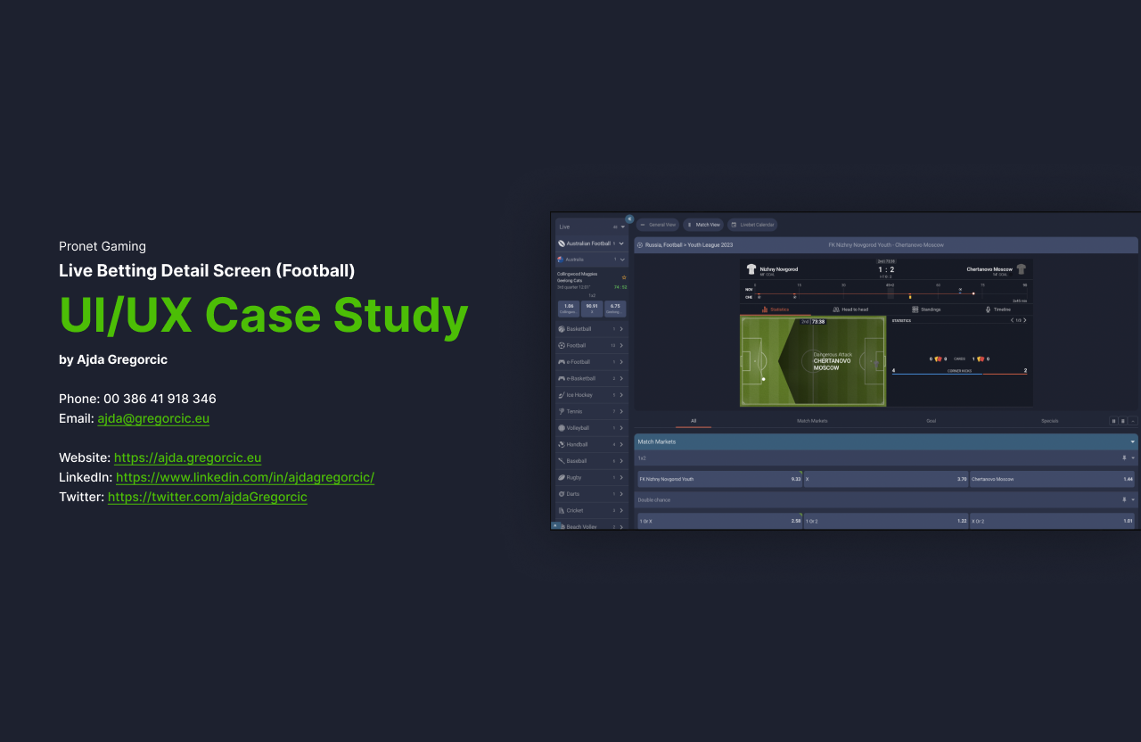
I completed a UI/UX study for a British company, examining the live sports betting experience on both desktop and mobile. Using a football scenario as an example, the aim was to understand one key screen and identify practical ways to make the experience clearer, more accessible and easier to use.
Live or in-play betting has changed how people engage with sporting events. Users can place bets while a match is in progress, with odds and available markets changing in real time. In such a fast-moving setting, the interface is not a secondary consideration: it has a direct impact on confidence, comprehension and retention.
Understanding the context
Live betting gives users an opportunity to act during an ongoing game, responding to live events and changing odds. The category is highly competitive, so a seamless interface can meaningfully influence which platform people choose to return to.
The challenge is not simply to surface more information. It is to make the right information understandable at speed, without creating unnecessary friction or uncertainty.
The study process
The work started with an in-depth review of the live-betting market, existing solutions and competitor patterns. I then evaluated the specific interface across desktop and mobile, looking for areas where the experience could become clearer and more consistent.
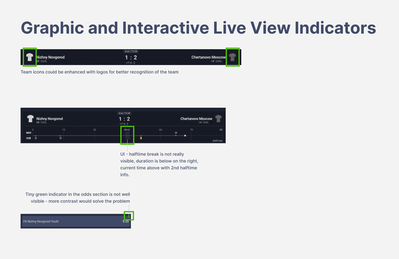
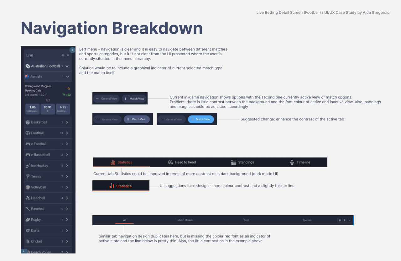
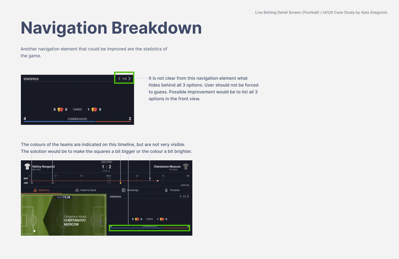
Some issues were apparent immediately. Text, icons and navigational elements used colour inconsistently, and low contrast made parts of the interface less accessible. A number of elements suggested that an action was available, but did not give enough visual information about what would happen next — a small detail that can make users hesitate.
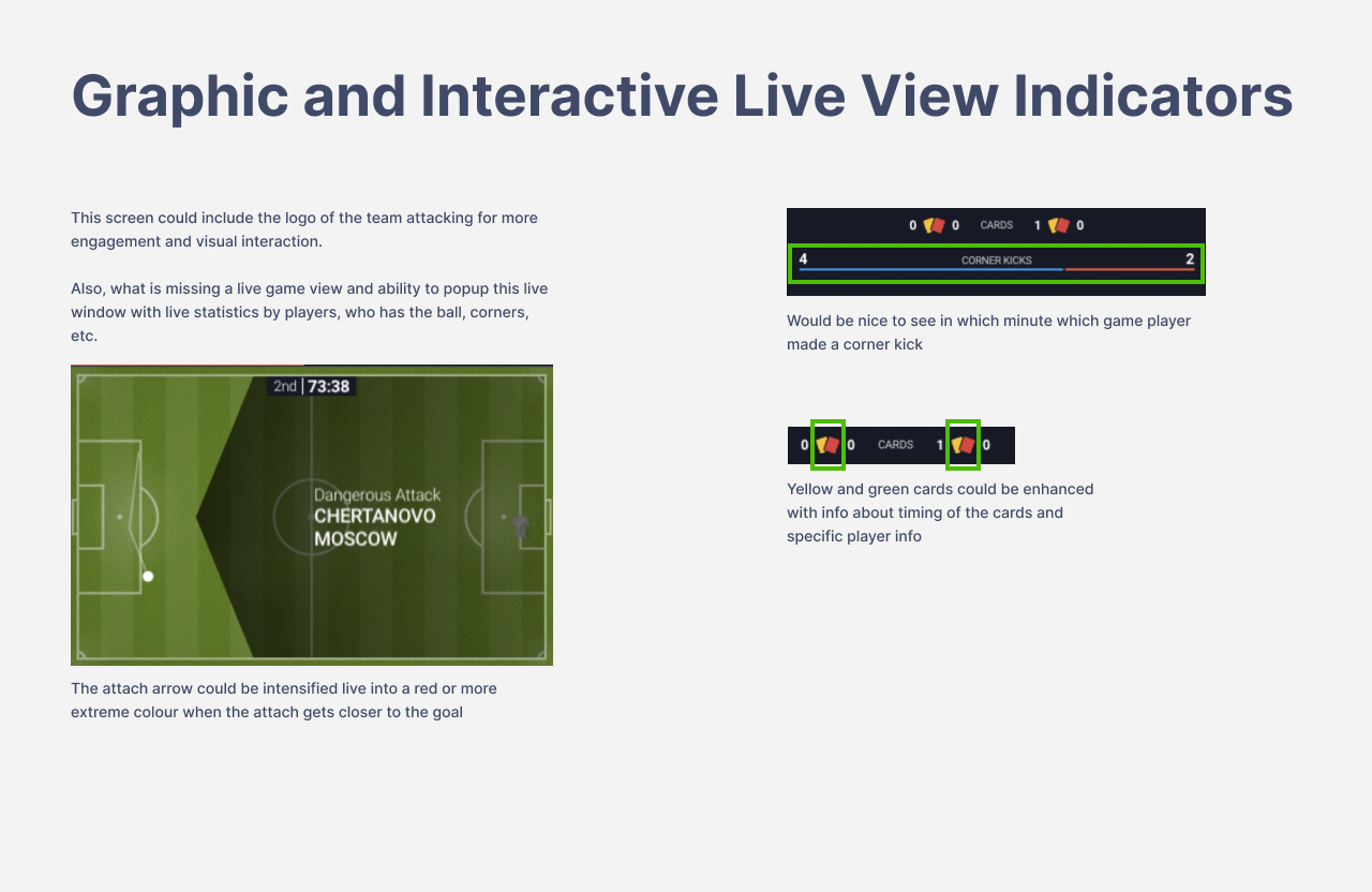
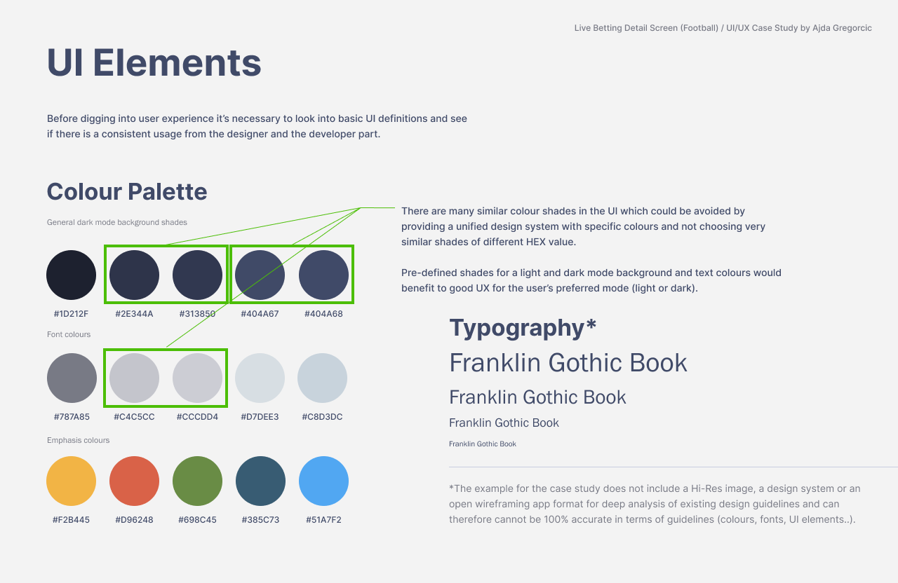
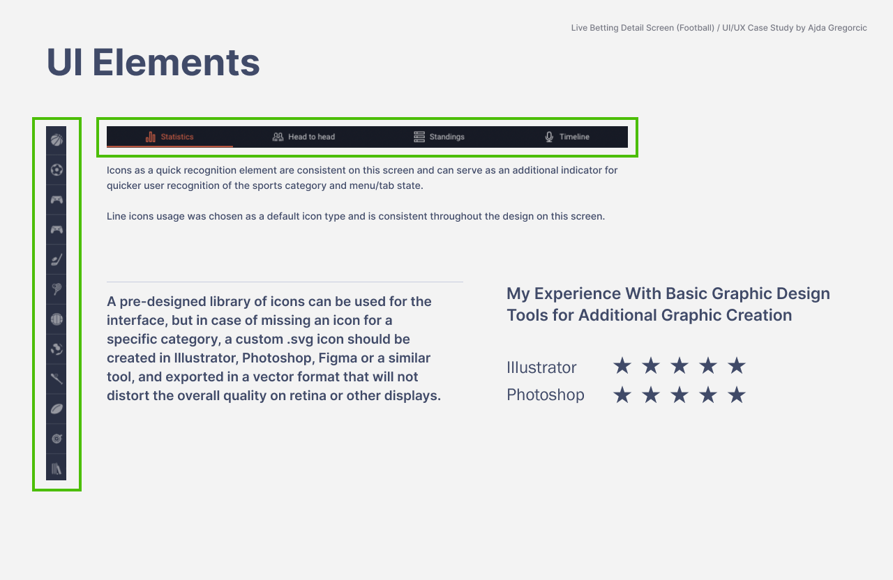
Accessibility was treated as a core part of the review, using W3C accessibility guidance as a practical reference point rather than as an afterthought.
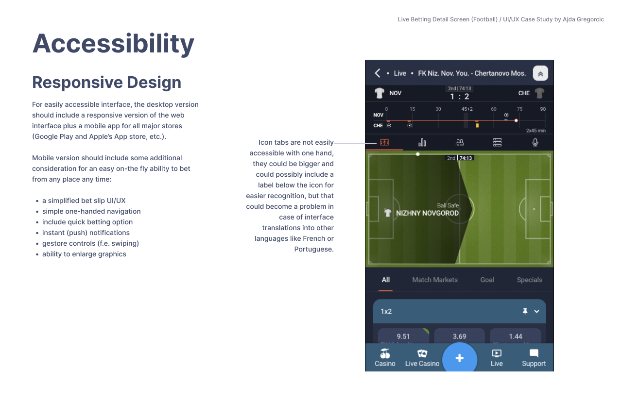
What the UI/UX study covered
The resulting analysis documented the current experience, identified the most important shortcomings and proposed changes that would support credibility, ease of use and a more coherent interface.
The study included:
- market and competitor research,
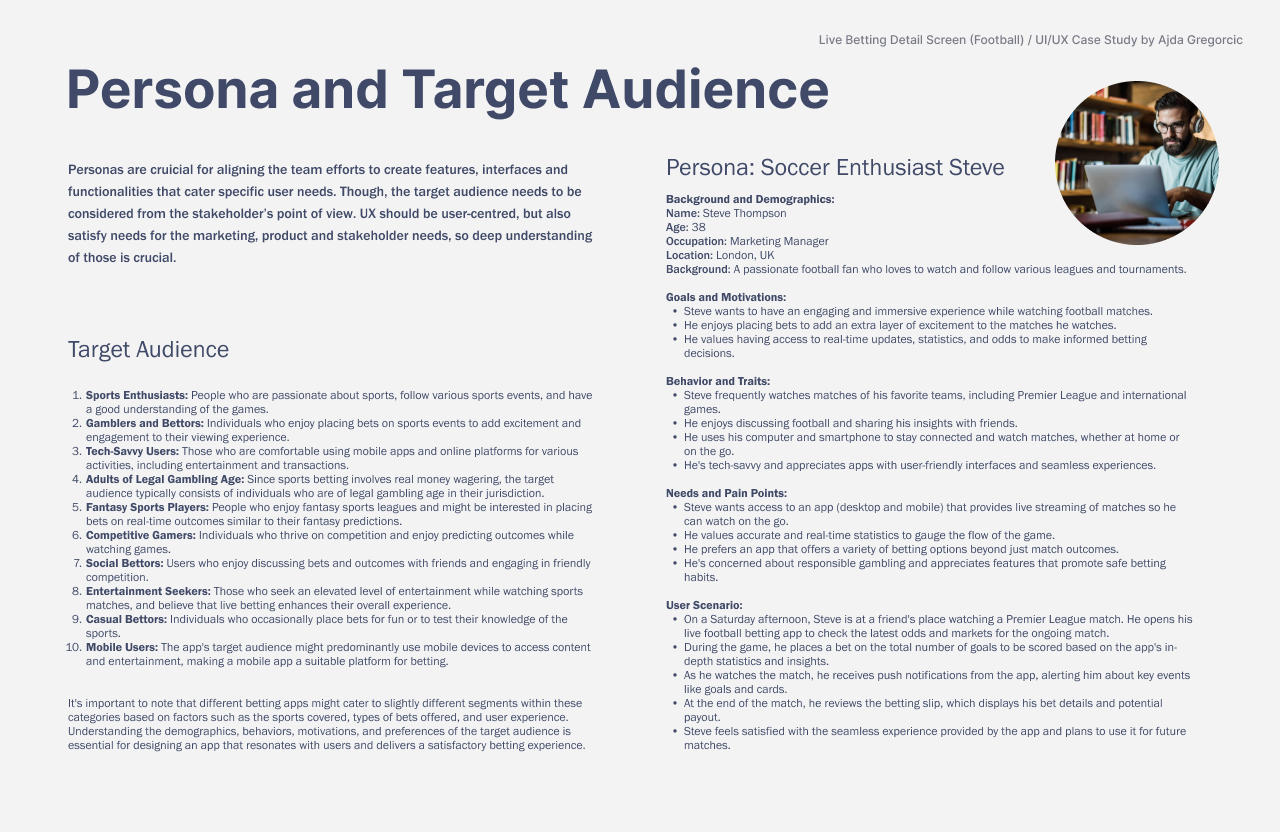
- user personas,
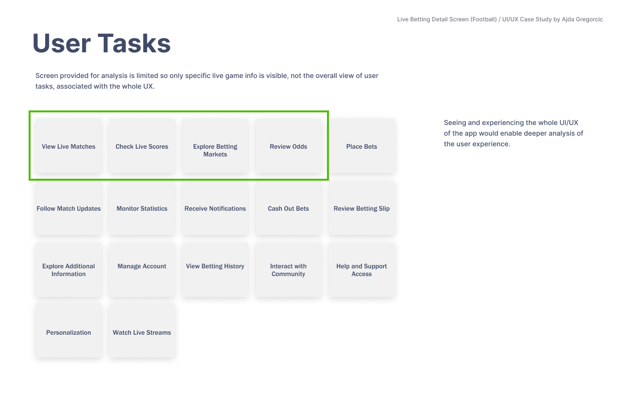
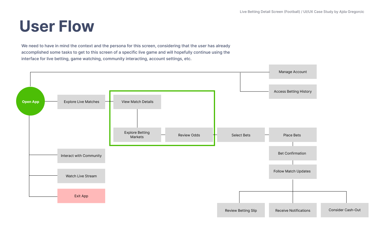
- key tasks and user flows,
- a desktop and mobile UI review,
- identification of interface elements that needed improvement,
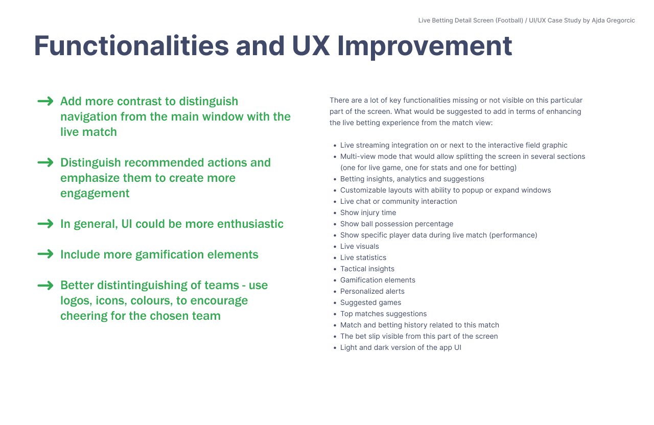
- detailed UI/UX recommendations, and
- accessibility considerations throughout the experience.
Clarity creates confidence
In technology products, users can learn a new interface — but when they encounter one that is more intuitive and engaging, they quickly recognise the difference. In a competitive category, they may also quickly choose another provider.
A refined, user-centred UI/UX can be a genuine differentiator. It helps people stay oriented, make decisions with confidence and build trust in the product they are using.
If you would like a focused UI/UX study of your own product or service, get in touch.