
Portfolio Information
- Created by: Ajda Gregorcic
- Date: February '22 - June '23
- Skills: Digital Strategy, Product Design, UX Research, Brand Strategy, Website Strategy, Design Systems
- Client: Blocksi
Shaping Brand, Product & Digital Experience for a Global EdTech Company
Over a period of nearly two years, I worked closely with product, marketing, customer success, and development teams to help shape Blocksi’s product experience, brand identity, website strategy, and digital communication.
What started as a UI/UX design role gradually evolved into a broader cross-functional position spanning product design, branding, website strategy, marketing support, design systems, and process improvement.
Blocksi provides student safety, content filtering, and classroom management solutions used by school districts, administrators, teachers, students, and parents worldwide.
My Role
Throughout the collaboration, I contributed across multiple areas of the business, including:
- product design and UX research
- brand identity redesign
- website strategy and redesign
- design systems and component libraries
- marketing and communication materials
- trade show and event assets
- user research and persona development
- cross-functional collaboration with product, development, QA, customer success, and marketing teams
- workflow optimization and documentation
Brand Evolution
One of the most impactful initiatives was leading the redesign of Blocksi’s visual identity.
What initially started as a design concept for marketing merchandise evolved into the company’s new logo and visual identity system. The redesigned logo better reflected the company’s mission of creating a safer digital learning environment for students.
Beyond the logo itself, the project included developing brand guidelines, creating reusable assets, supporting the transition across internal and external channels, and helping align a distributed international team around a consistent visual language.
![]()

The redesign extended into social media communication, email marketing assets, website graphics, promotional materials, and event branding.

I also designed a custom 20×20 trade show booth that continues to represent the company at international events and exhibitions.


Website Strategy & Transformation
Alongside branding initiatives, I worked closely with marketing, SEO, customer success, sales, and development teams on a complete website redesign initiative.
The goal was to better communicate Blocksi’s solutions, improve conversion paths, and create a more scalable digital experience for different user groups, including school administrators, teachers, partners, and prospective customers.
The redesign process included research, persona development, information architecture, user flows, analytics review, SEO insights, sitemap planning, and design system creation.


Product Design & UX
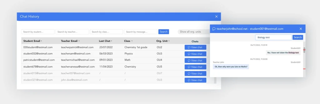
My primary focus was designing product experiences across multiple dashboards and applications used by school administrators, delegates, teachers, students, and parents.
The work included UX research, user flows, information architecture, feature planning, wireframing, prototyping, usability improvements, and design specifications for development teams.
Working closely with product owners, developers, QA specialists, and customer-facing teams allowed me to design solutions that balanced user needs, technical feasibility, and business goals.


The project also included designing AI-powered functionality, such as automated quiz generation and plagiarism detection features for teachers, helping improve classroom efficiency and digital learning experiences.
Beyond Design
Beyond visual and UX design work, I contributed to internal documentation, workflow optimization, process alignment, and collaboration practices that helped connect product, development, marketing, and customer-facing teams.
Working in a distributed international environment required balancing business goals, technical constraints, user needs, and operational priorities across multiple departments.
Results
This collaboration demonstrates my ability to work across branding, product design, website strategy, UX research, marketing, and digital experience initiatives within a growing international technology company.
More importantly, it highlights the value of connecting business objectives, user needs, technology, and communication into a cohesive digital experience.
The partnership continues today through occasional consulting, design, and marketing projects, reflecting the long-term trust built throughout the collaboration.